Artique
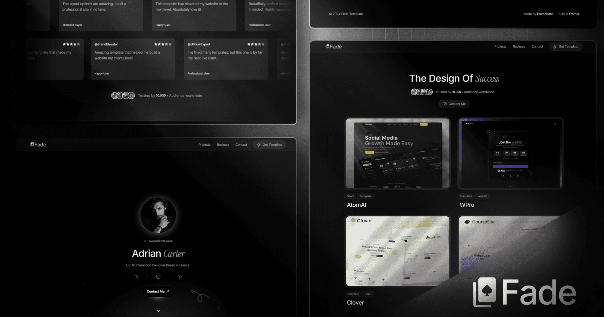
Artique set out to be more than just a portfolio — it had to feel like a personal gallery. The goal was to design a modern, minimal interface that gave creators space to shine, while adding just the right pops of color and motion to keep it fresh and expressive. It needed to feel premium, yet playful — like something you'd want to scroll through, not just glance at.
Client
Creative Portfolio
Service Provided
Web Design, Web Development

The Goal:
The site was built for designers, artists, and creative studios who care about aesthetics and detail. People who don’t just want to show their work — they want to make it felt. Artique helps them showcase projects with style, clarity, and a little personality — without ever getting in the way of the work itself.
1

The Challenge:
The biggest challenge? Balancing minimalism with personality. Too clean, and it’d feel cold. Too colorful, and it’d feel chaotic. We had to design a layout that felt sharp and simple — but still had depth, motion, and warmth. Every hover, transition, and layout decision was made to keep the user engaged without overwhelming the screen.
2

The Result
In conclusion, the final site is smooth, fast, and full of life. Projects load with seamless transitions, the UI stays out of the way, and pops of color bring just enough energy to make it memorable. Whether you're on desktop or mobile, Artique feels like a creative playground — elegant, responsive, and impossible to ignore.
3